Product podiums and mockups: choosing the right stage
How to pick a podium or mockup for product work: where the image is allowed to run, matching material and light to the product, and leaving room for type.
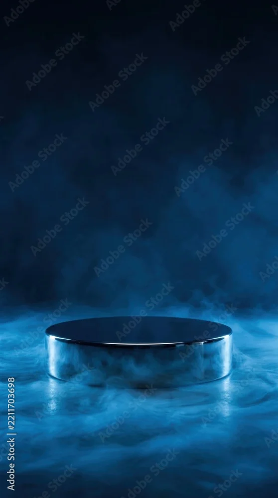
Choose a podium by where the image will be published, then by material, and only then by how it looks. That order matters because product feeds have rules that rule out styled scenes entirely: Google Merchant Center disallows a main product image containing products that are not sold with the item, so a bottle standing on a stone plinth surrounded by foliage cannot be your feed image, however good it is. Styled podium work belongs in ads, landing pages, enhanced marketplace content and social. Once the placement is settled, the useful tests are whether the podium's material says the same thing as the product category, whether its light matches the product shot you already have, and whether there is a quiet area left for type.
First decide where the image will run
This is the step most buyers skip, and it is the one that wastes the licence.
Google's Merchant Center specification for the main image attribute disallows promotional overlays, watermarks, added logos, borders, single-colour squares, placeholder graphics, and "products not sold with the main product" appearing in the image. In-context and lifestyle images have their own separate attribute, and the main image is meant to focus solely on the product. Best practice there is to frame the product so it fills at least 75% and no more than 90% of the image. The minimum size is 500 by 500 pixels, with about 1500 by 1500 recommended, and that 500-pixel minimum applies to all products from 31 January 2027.
Two consequences for anyone licensing a podium scene.
The scene is for the places where staging is allowed: paid social, display, a landing page hero, email, enhanced content on a product page, a deck. For the feed itself you need the plain shot, and no amount of beautiful styling changes that.
The second consequence is less obvious and worth checking against your own workflow. Google's specification also requires that images made with generative AI keep their embedded metadata, such as the IPTC DigitalSourceType tag, and says not to strip it even when editing. If your pipeline flattens or re-exports images and drops metadata on the way, that is now a feed problem rather than a housekeeping detail.



Material is a statement about the product
A podium is not neutral furniture. The material tells the viewer what kind of product this is before they read a word, and the most common failure I see is a material that argues with the category.
Stone, concrete, sandstone and terracotta read as solid, natural, made rather than manufactured. They suit skincare with a mineral or botanical story, coffee, spirits, candles, anything sold on craft. They are also the easiest to overdo: raw concrete under a cheap plastic bottle looks like a borrowed set.
Velvet, satin and gold trim read as gift, occasion and price. Fragrance, jewellery, watches, premium chocolate. They go wrong on anything practical: velvet under a kitchen tool reads as parody.
Glass, frosted glass and water read as clarity and purity, which is why they are everywhere in skincare and pharma. They also have a practical advantage, which is that a transparent podium does not force you to decide on a colour.
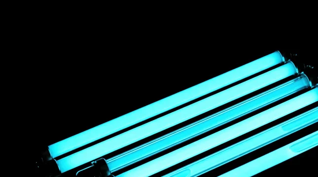
Neon, holographic and mirrored surfaces read as tech, gaming, energy and nightlife. They date faster than any other group, so for anything with a long campaign life they are a risk.
Wood and fabric read as domestic and warm. Food, tea, textiles, babycare.
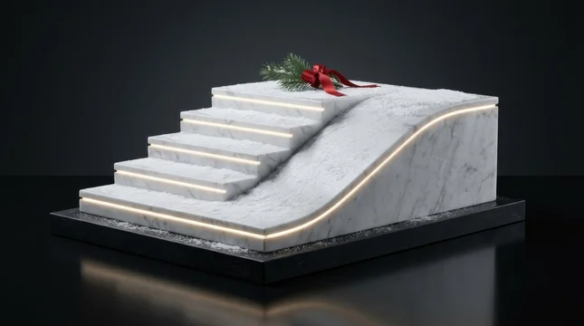



There is a compliance point hidden in this section for anyone selling in the EU. Under Directive (EU) 2024/825, applicable since 27 September 2026, an environmental claim includes implicit messages conveyed through symbols, colours, images and other visual elements, and generic claims such as "eco" or "environmentally friendly" are prohibited without demonstrated recognised excellent environmental performance. Moss, stone, raw wood and water styling around a cosmetic bottle is exactly that kind of implicit message. If the product has a substantiated environmental story, the styling supports it. If it does not, the styling is now part of a claim you cannot make.
The podium has to lose to the product
A product shot has one subject. If the stage is more interesting than the thing standing on it, the image has failed even though it looks good as a thumbnail.
Three checks catch this quickly. Desaturate the podium scene and see whether the product still has the strongest tonal contrast in the frame; if the backdrop wins, the scene is too loud. Squint at it, or look at it as a 200-pixel thumbnail, and notice what the eye lands on first. And count the competing details: fog, caustics, falling petals, strong patterned shadow and a textured surface in one frame will bury a small package.
This is also where tonal planning pays off. A dark product needs a mid or light podium and a light background; a white or transparent package needs a mid-tone or dark stage or it dissolves. Matching tone to tone is the most common reason a composite looks flat.
Mirrored and glossy surfaces deserve a specific warning. They look expensive and they double the work: a reflective podium needs the product's own reflection built underneath, correctly distorted and faded, or the composite reads as a sticker. If the product will be dropped in by a designer on a deadline, a matte surface with a soft contact shadow is the safer licence.
Light has to match the product you already have
If you are compositing a packshot onto a podium scene, the scene is the fixed element and the product is the fixed element too, which means one of them has to be chosen for the other. In practice the packshot already exists, so the podium has to be selected to match it.
Check three things against your product photograph. Direction: where is the key light, and is the shadow on the podium falling the same way. Hardness: a hard-edged shadow on the plinth next to a soft studio-lit bottle will not reconcile. Colour temperature: a warm golden-hour scene under a cool, evenly lit product shot needs a grade on one of them, and grading the product is usually the thing you are not allowed to do.
Overhead and slightly raised lighting suits bottles, jars and anything with a shoulder. Low side light suits texture — paper, fabric, powder, food. Backlight suits glass and liquid, and almost nothing else.

 00:08
Leaving room for type
Most podium images end up carrying a headline, a price or a logo, which makes the empty part of the frame as important as the podium.
The usable area has to pass a contrast check, not a vibe check. WCAG 2.1 SC 1.4.3 sets a minimum contrast ratio of 4.5:1 for normal text and 3:1 for large text, where large means 18 point or above, or 14 point and above when bold. Measure against the darkest or lightest part of the area the text will actually sit on, not the average of the image: a gradient sky that passes at the top can fail at the horizon.
Two practical notes. Fog, bloom and glow effects move brightness around across a video clip, so a caption that passes on frame one can fail halfway through. And if the layout needs a logo in a corner, check that corner specifically, because that is where stock scenes tend to put their vignette.
Mistakes to check for before licensing
- The scene contains props you do not sell, and your intended placement is a product feed rather than an ad.
- The podium is more saturated, more detailed or higher in contrast than the product will be.
- Product and podium are the same tone, so the silhouette disappears.
- Shadow direction on the podium contradicts the shadow in your packshot.
- A mirrored or wet surface, with no time budgeted to build the product's reflection.
- Natural and botanical styling attached to a product with no substantiated environmental claim.
- No clean area for type, or an area that fails the contrast ratio where the text will actually land.
- The podium's top surface is smaller than the product's footprint, which is impossible to fix in composite.
- A dense pattern or strong gobo shadow across the exact spot where the product stands.
- Resolution matched exactly to your output size, leaving nothing for the crop and rotation every layout eventually needs.
- For video, a camera move you cannot track a composited product into.
What to do next
Work in this order and the choice gets much faster: name the placement, check whether staging is allowed there, open your packshot and note its light direction and tone, then search for a podium that matches it. Pick the material last, because by that point only a handful of scenes will still be candidates.
You can browse my mockups and podiums collection for stone, glass, velvet and concrete stages, neon and reflective sets, and blank packaging mockups for label work.


Sources
- [Image link [image_link] specification, Google Merchant Center Help](https://support.google.com/merchants/answer/6324350)
- Understanding SC 1.4.3 Contrast (Minimum), W3C WCAG 2.1
- Directive (EU) 2024/825: generic environmental claims and practices banned in the EU from 27 September 2026