Textures and surfaces
A background texture is what a layout needs when it wants a material but not a subject: something to sit the type and the product on, with no scene competing for attention. Choosing between plaster, veined marble, linen and rusted metal is less a question of style than of how much tonal variation the surface puts behind your text. That variation is a budget, and once it is spent the copy stops reading.
The contrast budget
The limit is set by a number you can measure. WCAG AA asks for a contrast ratio of at least 4.5:1 for normal text and 3:1 for large text, where large means 18 point or 14 point bold — roughly 24 and 18.5 CSS pixels. Ordinary 16-pixel body copy is not large text, so it needs the full 4.5:1.
Over a photograph that ratio is not measured against the average. The WCAG failure condition F83 asks for sufficient contrast between the text and the parts of the image that are both behind it and most like it, and its quick check compares the type against the lightest area for light text, or the darkest for dark text. So the worst patch under your paragraph sets the result, not the overall tone — and the guidance advises raising contrast further over patterned backgrounds.
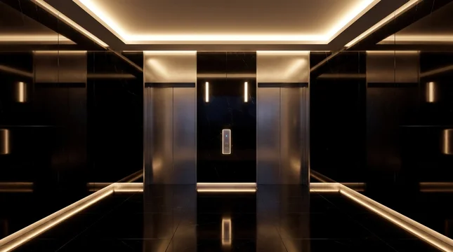
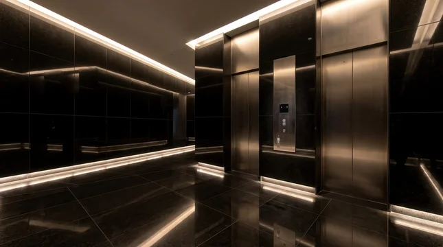
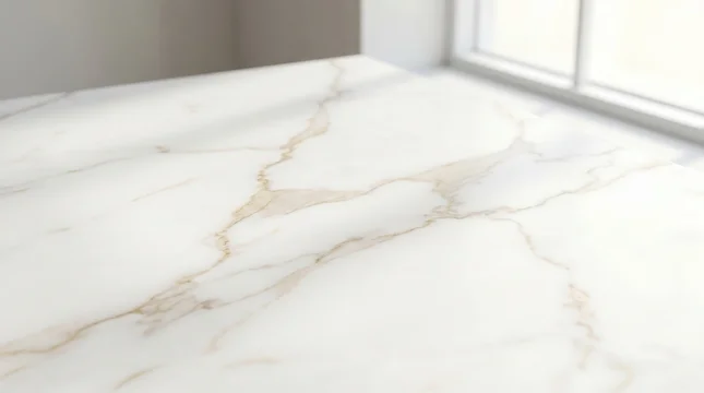
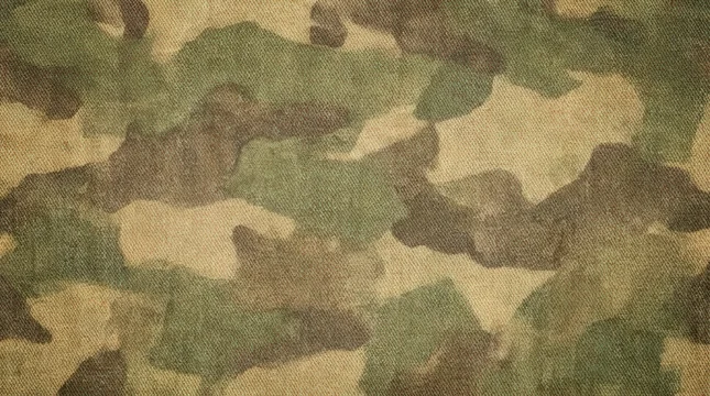
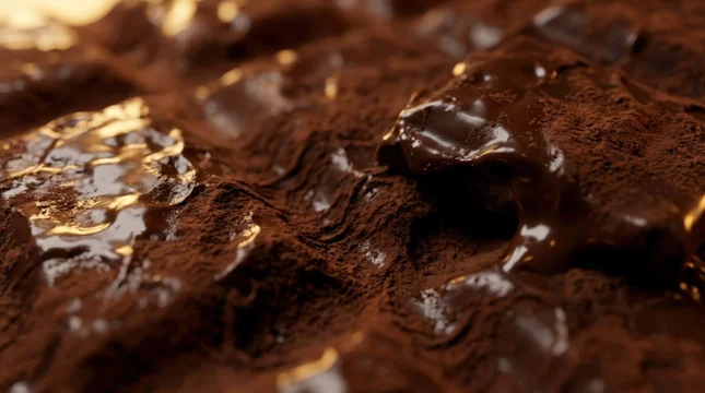
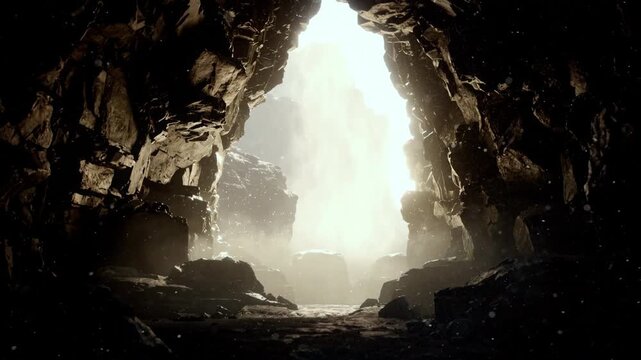
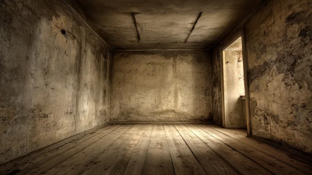
That splits the material into two groups. Plaster, fine sand, matte paper, brushed metal and fogged concrete hold a narrow tonal range and spend almost nothing of the budget, which is why they survive small text. Veined marble, coarse grain, rust, crumpled foil and anything with specular hotspots hold a wide range: they pass a casual look at the average and fail on the one bright vein crossing the fourth line.
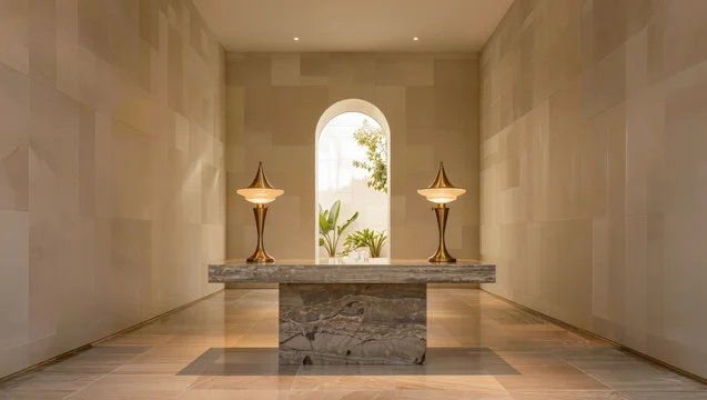
The least glamorous surfaces are the ones buyers come back for, and the ones libraries are thinnest on. Most texture shots are lit for drama, with a falloff, a hotspot or a vignette, which is exactly what makes them unusable behind type.
Where the dramatic ones belong
A high-contrast surface is not wasted, only misplaced when it sits under body copy. It works behind a single large word, under a logo lockup, as a section divider or narrow strip, as the surface of a card, or where the type is confined to one quiet corner. If the layout needs both the drama and the paragraph, use a flat panel or a solid scrim behind the text rather than dropping the texture's opacity, which dulls the material without fixing the worst pixel.
Scale matters as much as contrast. Fine grain that reads as material at full size turns into noise at a quarter of it, so judge the texture at the dimensions you will ship.
Before you license
- Decide the smallest text that will sit on the surface before you choose the surface.
- Find the worst area rather than the average: lightest patch for light type, darkest for dark.
- View it at final size, not fit-to-screen.
- Check the crop you will ship: a seam that is harmless in 16:9 can land under the headline at 9:16.
- Prefer a directionless surface if the layout may be flipped or mirrored.
- For video, watch the whole clip, since drifting fog or moving caustics change the worst pixel over time.
- Confirm there is one genuinely flat region, or plan the panel.
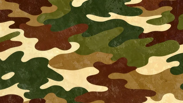
For wood, which behaves differently because grain has a direction and a specular response, go to wood and rustic surfaces; for a constructed or repeating surface rather than a photographed one, geometric shapes and patterns.

































 00:10
 00:10



 00:10
 00:10





 00:07












 00:08
 00:08


 00:08
 00:05












 00:08






Need a shot that isn't here? Write to me.
Get in touchMore collections
See all 655
Minimal scenes with copy space
Clean compositions that leave deliberate empty space for a headline or a product.
 483
Christmas and New Year
Festive interiors, trees, gifts, ornaments and winter scenes for seasonal campaigns.
 299
Winter and snow
Snow, frost and ice for winter campaigns outside the Christmas season.