Minimal scenes with copy space
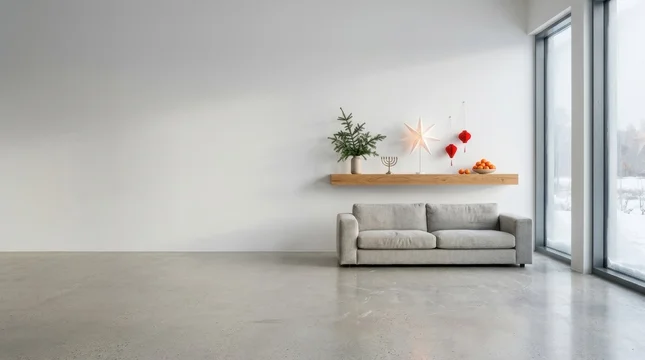
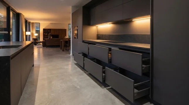
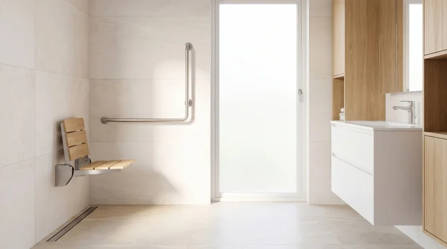
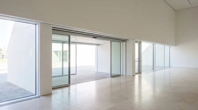
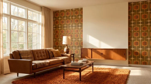
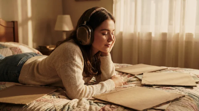
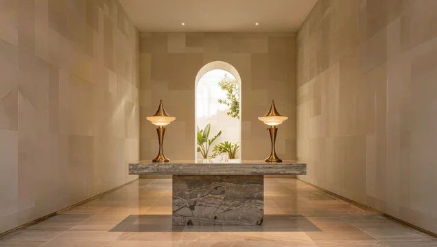
A layout that already has its words needs a frame that will not argue with them. These are scenes built so a headline, a logo lockup or a product can be dropped straight in: one subject or none, and a quiet area even enough to carry type. The reason to come here rather than to a general background collection is position — not whether the frame has room, but whether the room is where your text block already is.
What makes space usable
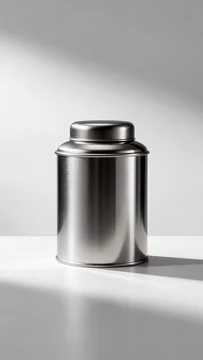
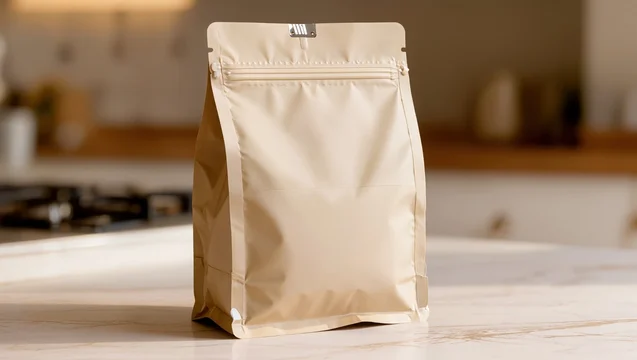
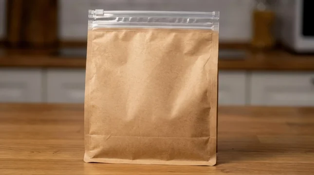
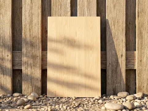
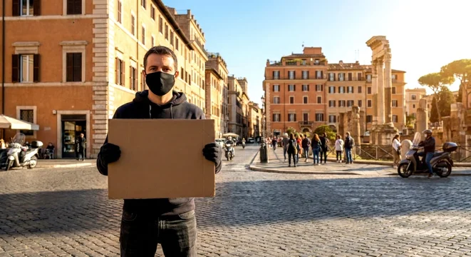
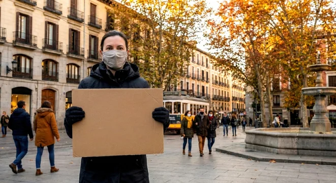
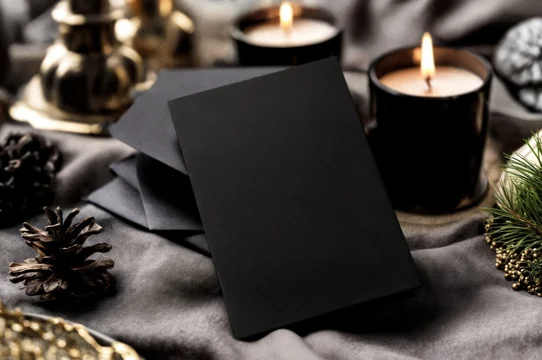
Adobe Stock's own copy space filter returns two different things: a mockup with a blank object in it, such as a hand holding an empty card, and an open area within the scene, such as a sky. Only the second is a plate for type. The first is a surface inside the picture, and anything you set on it inherits its perspective, light and shadow.
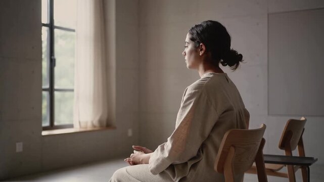
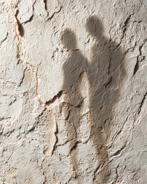
Three properties separate a usable plate from a patch that merely looks empty. Tone has to be continuous across the block rather than merely pale: a gradient drifting across it leaves one text colour working at one end and failing at the other. No edge may cross it — a horizon, a cable, a table line or the boundary of a cast shadow reads as a rule struck through the paragraph. And the detail has to be coarser than the letterforms; foliage, grain and bokeh highlights at the scale of the type turn legible copy into vibration.
Four positions
Four placements cover almost every layout: a full-width band across the upper third, a vertical plate down one side with the subject on the other, a ring of quiet around a centred subject, and a band below the subject. They are not interchangeable buys: they do not survive a change of format equally.
The arithmetic is unforgiving. A centred square crop of a 16:9 frame keeps 56% of its width; a 9:16 crop keeps 32%. A plate occupying the left third of a wide frame is gone entirely from a centred vertical crop, while a full-width band loses its ends but keeps its middle. If more than one ratio is coming, buy the band.
What the platform takes
The edges are never yours. For 16:9 television, EBU R 95 keeps graphics within 5% of the picture edges and essential action within 3.5%. Vertical platforms take more and publish less: TikTok's ad specification warns that anything outside the safe zone "might be covered or cropped", that the in-feed zone is tighter than the opening one, and that it shrinks as the caption lengthens — it ships templates and a preview tool rather than figures. On Shorts, Google recommends 9:16, notes that horizontal assets play with blurred bands top and bottom, and places a call-to-action button three seconds in. Plan the bottom third of a vertical frame as lost.
Before you license
- Decide where the text block sits, then search by that position rather than by subject.
- Run Preview Crop at every ratio you will ship, with the block in place.
- Prefer a full-width band to a side plate whenever more than one format is coming.
- Look for an edge crossing the block: horizon, cable, table line, shadow boundary.
- Judge the plate at final size, not fit-to-screen.
- On video, scrub the whole clip — a drifting cloud or a moving hand walks into the block.
For a frame where the product stands on something rather than in front of something, go to mockups and product podiums; where the brief wants a material rather than a scene, textures and surfaces.



 00:08








 00:10




 00:10















 00:10
 00:10
 00:05


 00:05

















 00:05














Need a shot that isn't here? Write to me.
Get in touchMore collections
See all 1,185
Textures and surfaces
Marble, stone, plaster, fabric and metal surfaces for backgrounds, overlays and product scenes.
 483
Christmas and New Year
Festive interiors, trees, gifts, ornaments and winter scenes for seasonal campaigns.
 299
Winter and snow
Snow, frost and ice for winter campaigns outside the Christmas season.