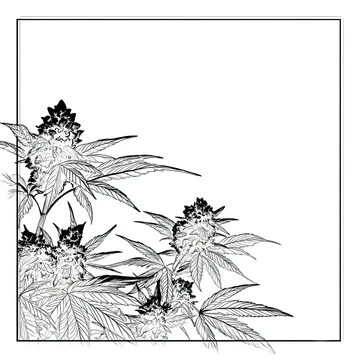
Gobo and shadow overlays: blend modes and common traps
How to lay a shadow or gobo texture over a flat scene, which blend mode to use, what to check before licensing, and when the effect becomes a cliche.

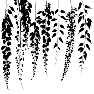
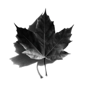
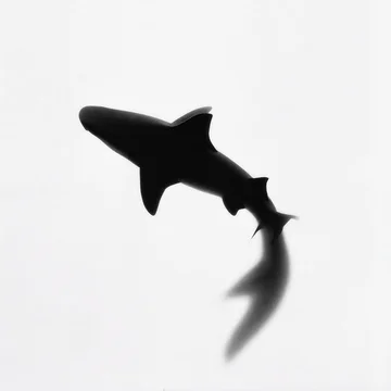
A shadow overlay works the way the original lighting trick worked: the pattern has to stand between a light and a surface, and your blend mode is what decides which is which. A black pattern on white goes in Multiply, because multiplying any colour with white leaves it unchanged, so the white area disappears and only the pattern darkens the scene. A white pattern on black goes in Screen, where black is the neutral colour instead. Everything after that is a question of making the shadow obey the light that is already in the shot, which is where most overlays fail.
Where the word comes from, and why it matters
In theatrical lighting a gobo is a physical object placed in the light path to shape the beam. It sits in the gate, at the focal point between lamp and lenses, which is what makes the projected pattern sharp. A pattern placed further forward, after the optics, does not resolve into a focused image; that is more precisely a flag or a cucoloris), often shortened to "cookie". The term itself came out of early film production, where crews put patterns between their lights and the scenery, and became standard in cinema studios in the 1930s.
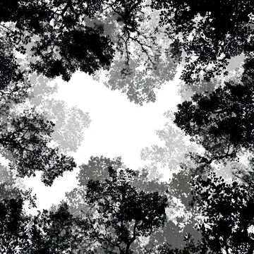
That distinction is the first decision in choosing an asset, before any software question. A hard-edged, high-contrast pattern reads as a light source close to a gobo at its focal point: a projector, a bright window with crisp mullions, a spotlight. A soft, broken, uneven pattern reads as foliage several metres away from the wall. Pick the wrong one and no amount of blending will fix it, because the viewer is reading the quality of the light, not the shape.

The two blend modes that do the work
The formulas are worth knowing, because they explain exactly why these two modes behave as they do. In the W3C compositing specification, Multiply is defined as the source colour multiplied by the backdrop, so "the resultant colour is always at least as dark as either the source or destination colour", and "multiplying any colour with white preserves the original colour". Screen is the inverse: "the result colour is always at least as light as either of the two constituent colours", and "screening any colour with white produces white; screening with black leaves the original colour unchanged".
In practice:
Multiply is for shadow. Black-on-white assets, which is how most gobo textures ship, go here. It only ever darkens, so it behaves correctly over a light or mid-tone surface and collapses over an already dark one.
Screen is for light. If you have a white-on-black pattern — a light leak, a projected beam, dappled sunlight treated as highlight rather than shade — Screen puts it on top of a dark scene without washing out the blacks.
Overlay and Soft Light are for contact rather than contrast. Overlay "multiplies or screens the colours, depending on the backdrop colour value", and Soft Light "darkens or lightens the colours, depending on the source colour value". Both preserve more of the underlying texture and colour than Multiply does, which is what you want on skin, fabric or a textured wall where a flat Multiply layer looks like a sticker.
Darken is the one to reach for when a Multiply layer is muddying the midtones: it "selects the darker of the backdrop and source colours", so it replaces the surface only where the pattern is genuinely darker, leaving the rest untouched.
Making the shadow obey the light
Four things betray an overlay faster than anything else, and all four are fixable in a minute.
Opacity. A real shadow is not the absence of light; it is lit by everything else in the room. A Multiply layer at 100% almost never looks right. In most daylight scenes it sits somewhere between 35% and 70%, and you judge it by whether the darkest part of the shadow still shows the surface texture underneath.
Direction. The overlay has to fall away from the existing light source. If the window in the shot is on the left, the shadow runs to the right, and the pattern has to be flipped rather than rotated if that changes which way the leaves point.
Perspective. A shadow lands on a surface and follows it. On a wall behind a product, that means a slight vertical skew; on a table top receding from camera, a stronger transform. Dropping a flat rectangle of pattern onto a receding plane is the single most common giveaway.
Softness falls off with distance. The further the object is from the surface, the softer the shadow edge. A pattern that is uniformly sharp across the whole frame tells the viewer the pattern is sitting on the glass, not in the room. A small amount of graduated blur across the frame does more for believability than any blend mode choice.
 00:08
 00:08
 00:10
 00:08
Where it earns its place
The overlay is at its most useful where the scene is deliberately empty and needs an event.
Product and packaging mockups are the obvious case: a flat-lit box on a seamless background is accurate but inert, and a window shadow across the corner gives it a time of day and a room. The same applies to podiums and plinths, where the shadow also does the job of anchoring the object to the surface.
Architecture and interior renders benefit for a different reason. A render has no atmosphere by default, and a gobo pattern across a concrete wall adds the only thing the render cannot generate: evidence that there is a world outside the frame.
Text-over-image layouts are the quiet use case. A shadow overlay gives you a legible dark area exactly where you need it, without a flat scrim over the whole picture.
Motion work uses them differently again. A moving leaf shadow on a wall is a loop you can lay under titles for the whole length of a sequence, and in Multiply it costs nothing to grade. The thing to check in a clip is that the movement is irregular — real foliage moves in gusts, and a shadow panning at constant speed looks mechanical within three seconds.
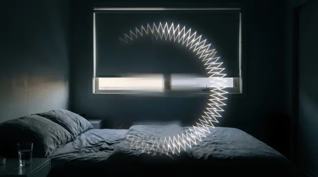


Where it becomes a cliche
Some of these patterns have been used so heavily that they now date a design more precisely than a typeface would.
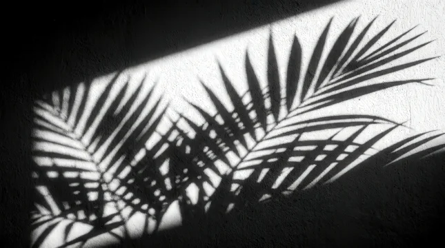
The monstera or palm leaf shadow on a pastel wall was the default look of boutique branding for several years, and it still reads as that period. It is not unusable, but it is not neutral either, and in a beauty or wellness brief it will look like every competitor.
Hard venetian-blind stripes across a face carry a specific reference — film noir, then every corporate thriller since — and they bring narrative weight whether or not you wanted any.
The third trap is structural rather than stylistic: using an overlay to rescue a composition that does not work. A shadow adds interest to an empty frame and clutter to a busy one. If the underlying image has a hierarchy problem, the pattern competes with the subject instead of supporting it.
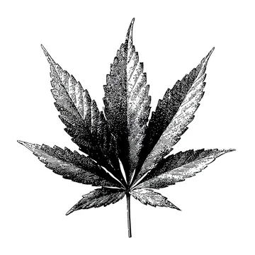
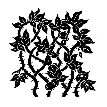
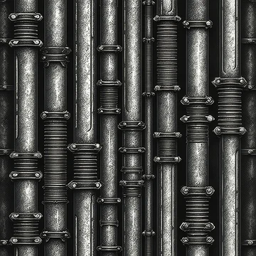
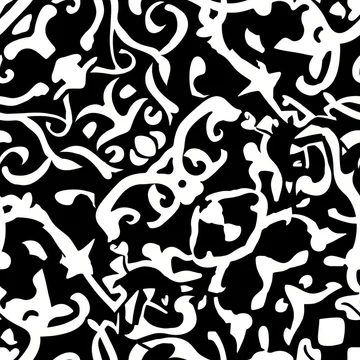
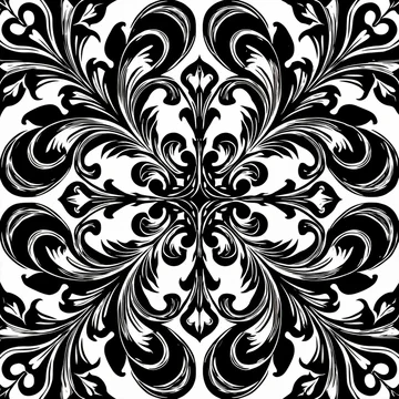
Geometric and ornamental patterns are a way out of all three, because they read as design rather than as a borrowed location: arabesque and filigree for anything decorative or historical, brick and masonry gaps for industrial work, triangles and sharp ridgelines for something contemporary.
Checklist before you license
- Open the file at 100% and look at the pattern edges. JPEG artefacts around hard black-on-white transitions are the most common defect in this category and they show up as grey fringing the moment you put the layer in Multiply.
- Check that the white is actually white and the black actually black. A grey cast means the overlay will tint the whole scene when you blend it.
- Decide whether you need hard or soft before you search, and pick the asset for that, not for its subject.
- If the pattern has to cover a large wall or repeat, confirm it is seamless. A pattern described as seamless should tile without a visible seam at the join.
- Prefer a pattern with real negative space. A dense texture leaves nowhere for the product or the type to sit.
- For a metal-gobo look, check for bridges: the small connecting tabs that hold the centre of an enclosed shape in place on a physical steel gobo. They are authentic in a projection, and wrong in a shadow cast by leaves.
- For video, check the loop point and watch the clip twice through. Also check for banding in the soft gradients, which gets worse once you grade the layer.
- Make sure the resolution exceeds your canvas. Overlays almost always get scaled up and rotated, and anything at exactly your output size will end up soft.
- For a shadow in daylight, prefer a neutral or slightly cool pattern. Shadows outdoors are filled by sky light, so a warm grey overlay fights the scene.
What to do next
Decide two things before you open any stock site: whether the light in your scene is close and hard or far and soft, and whether the pattern is doing the darkening or the lighting. Those two answers reduce a category of thousands of near-identical files to a handful. Then test at low opacity first — if the overlay only works at full strength, it is the wrong pattern.
You can browse my gobo light and shadow collection for black-on-white textures, architectural and ornamental patterns, and moving foliage shadows for motion work.

 00:07
 00:10