Accessibility and inclusion in stock footage: a buyer's guide
Which accessibility and inclusion shots are scarce on stock sites, what to look for in them, and the mistakes that make a module or campaign look dated.
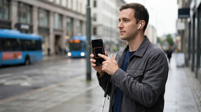
The most useful accessibility and inclusion footage shows a specific situation, not a symbol: a person using a screen reader, a low-floor bus with its ramp out, a quiet room in an office. Generic "diversity" imagery is plentiful, but concrete scenes are scarce. On Adobe Stock, a search for a blind person using a smartphone screen reader returned 10 files in August 2026, against more than a million for "inclusion". If you are illustrating training, a compliance report or a campaign, search for the scene you need, check the details of any assistive device, and prefer people shown doing ordinary things over people shown as a message.
I make stock video and images in this area, and everything I make is created with generative AI and labelled as such on Adobe Stock. That matters for a topic about representation, so I will come back to it. Most of this guide, though, is about what to look for, whoever made the footage.
Why buyers need this footage now
The biggest single driver in Europe is law, not marketing. The European Accessibility Act applies from 28 June 2025. It covers banking services, e-commerce, e-books, passenger transport, telephony, audiovisual media services, and hardware such as computers, smartphones, ATMs and ticketing machines. It also applies to businesses outside the EU that sell into it.
Every organisation in scope is producing staff training, customer guides, accessibility statements and landing pages. All of that material needs pictures, and very little of it should be a stock photo of a wheelchair icon.
The second driver is the size of the audience. In June 2026 Disability:IN and the American Institutes for Research put the US disability consumer market at $675 billion, counting working-age adults only. The study uses a definition of disability that leaves out chronic illness, neurodivergence, learning disabilities and mental health conditions, so it understates the real market. For a buyer, the practical point is that disabled customers and colleagues are part of the ordinary audience of a bank, a railway or a software product, and the imagery should reflect that.
At the same time, the language around this work has shifted. Adobe's own 2026 creative trends forecast leans towards authentic human connection and lived, local detail rather than slogans. In my experience that is exactly where literal "diversity and inclusion" posters now fail: they look like a campaign from several years ago.
Where the stock library is thin
Before I make a series, I search Adobe Stock for the exact scene I have in mind and count the results. These are my own numbers: Adobe Stock search counts, August 2026. Counts change over time, and a new upload can move them quickly, but the pattern is clear.
Broad terms are saturated. "Inclusion" returned 1,121,351 files, "inclusion diversity" 512,084 and "diversity equity and inclusion" 150,417. Flat vector accessibility icon sets returned 38,066.
Specific scenes with people are scarce. "Blind person using smartphone screen reader" returned 10. "Sensory friendly space neurodivergent child" returned 18. "Autistic adult workplace" returned 37. "Wheelchair traveler airport accessible travel" returned 143, and "deaf employee sign language meeting" 285.
Scenes without people are scarcer still. "Low floor bus wheelchair ramp public transport" returned 8, as did "accessible hotel room interior wheelchair friendly". "Empty inclusive classroom flexible seating interior" and "accessible kitchen universal design lowered counter" returned 3 each. "Color blind accessible palette design contrast checker" returned nothing at all.
For you as a buyer, this means two things. First, if your first search returns thousands of near-identical images, reword it as a scene: who, doing what, where. Second, if you need something specific and it genuinely does not exist, that is not a failure of your search. It is a gap in the library.


Show people doing things, not being a message
A 2024 study presented at CHI, "They only care to show us the wheelchair", ran focus groups with 25 people with disabilities and found that text-to-image models repeatedly produced reductive archetypes for different disabilities. A 2026 benchmark from Utrecht University, INCLUDE-BENCH, tested 17 models and found that generic disability prompts mostly produce wheelchair images across all of them.
That bias is not unique to AI. It mirrors the stock library as a whole, which is why the wheelchair is overused and almost everything else is missing. Most disabilities are not visible, and a library that shows only one device teaches your audience that disability means one thing.
When I choose or make a shot, I ask one question: what is this person doing? Paying at a counter. Interviewing a job candidate. Following a video call with captions. Boarding a tram. If the only answer is "being disabled" or "being diverse", the image will read as a statement, and your audience will notice.
The same test works for age. A woman in her late sixties paying by phone in a café, or a senior employee explaining something to a younger colleague, reads as competence. A lonely figure by a window reads as pity.



Avoid images built around overcoming: dramatic backlight, tears, a raised fist, a caption about having no limits. In my judgement these images age worst of all: they turn a colleague or a customer into a lesson for the viewer.
When the best shot has no people in it
For a lot of accessibility material, the right image is an environment or an object. Compliance reports, policy pages, slide covers and course modules usually need space for a heading and should not tie the message to one face, one country or one kind of disability.
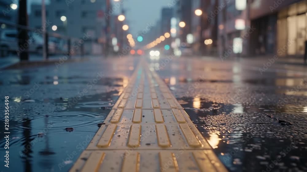
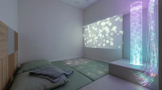
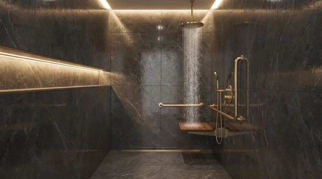
Useful scenes without people include tactile paving on a platform edge, Braille and raised numbers on lift buttons, a low-floor bus with its ramp deployed, a step-free shower with a well-designed grab rail, a sensory room with soft light, a quiet room in an office, and a classroom with mixed seating. An empty scene does not represent anyone badly, and it localises easily: the same tactile paving works for a Dutch railway and a Canadian city.
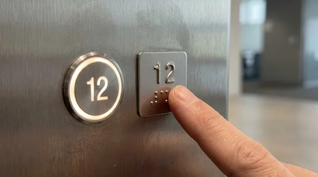
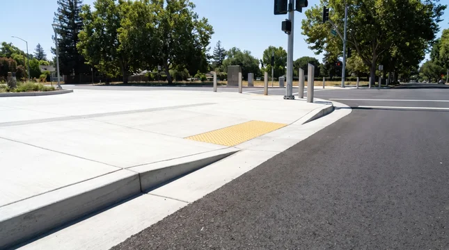
Check two things in this kind of footage. The first is style. Much of what exists looks like a hospital catalogue: cold light, grey plastic, white tiles. An accessible bathroom or hotel room can look like any well-designed interior, and that is usually the message your organisation wants to send. The second is space. Look for clean areas of wall, sky or floor where your text will sit.


A note on AI-generated footage
My work is made with generative AI and labelled as such on Adobe Stock, and people and property in it are fictional. I think buyers should know this, and Adobe requires every generated file to be labelled as such when it is submitted. Generated footage has real advantages here: no identifiable individual is put on display, and scenes that are expensive to stage, such as an accessible hotel room or a bus ramp in the rain, become available.
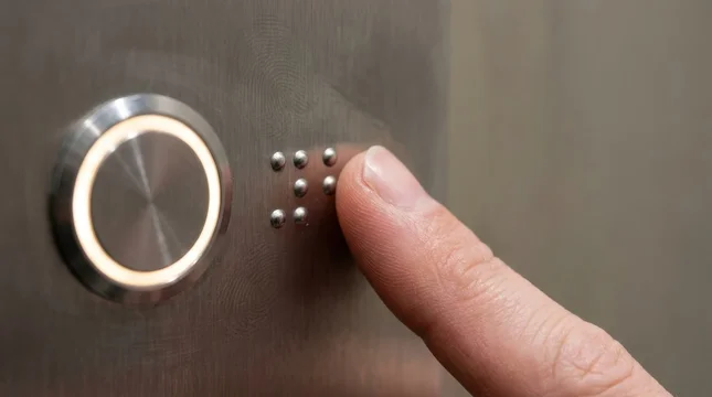
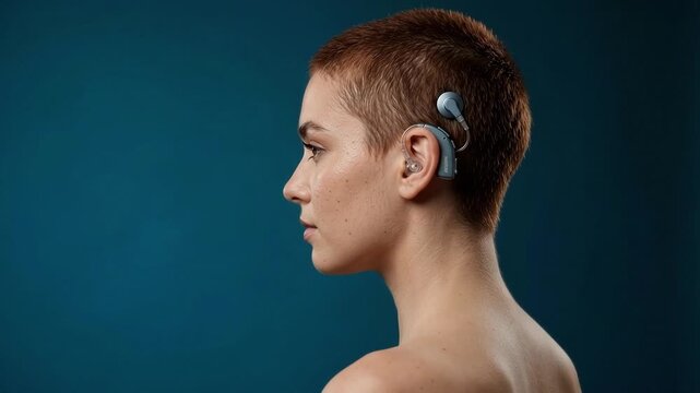
It also has specific risks, and they are worth checking whoever made the file. Generators often get assistive devices wrong: wheelchairs with impossible geometry, prostheses with extra joints, hearing aids and cochlear implants of the wrong shape, grab rails fixed to nothing. Braille is a common failure; a real Braille cell is a grid of two columns and three rows, and a random pattern of dots is noticeable to anyone who reads it. Sign language is a particular problem, because a generated hand shape can be meaningless or wrong.
Signs and screens are the other trap. Generated signage often contains invented words. If your footage includes a sign, a screen or a label, read it at full size.
People who use these devices will spot an error immediately. A wrong detail undoes the point of using the image at all.
 00:05
00:05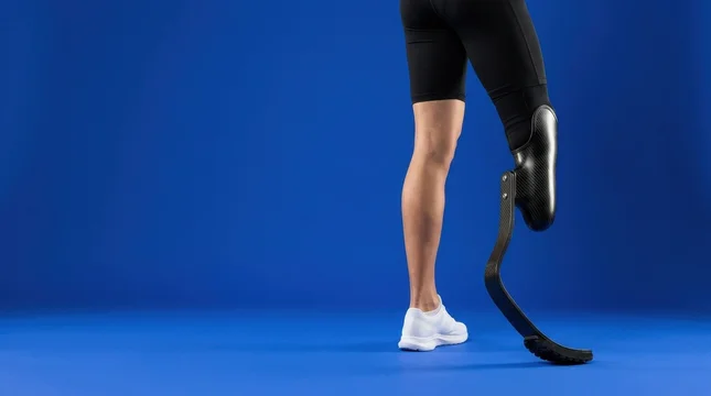
Checklist: before you license
- Search for a scene, not a concept. "Deaf employee sign language meeting" finds something useful; "inclusion" does not.
- Ask what the person in the shot is doing. If the answer is "representing a group", keep looking.
- Check every assistive device at full size: wheel geometry, prosthetic joints, hearing aid shape, grab rail fixings, Braille dot patterns.
- Read every sign, screen and label in the frame. Invented text is common in generated footage.
- Avoid overcoming imagery: dramatic backlight, tears, slogans about having no limits.
- Avoid literal DEI posters: circles of coloured hands, puzzle pieces, lettered blocks.
- Do not let one device stand for all disability. Consider invisible disabilities, hearing and sight, neurodivergence and age.
- For reports and slides, prefer environments and objects with space for text.
- Check the licence notes: whether the asset is labelled as AI-generated, and whether people in it are fictional or covered by a model release.
- For video, watch the whole clip at full size, including the last two seconds, where generated footage most often breaks down.
What to do next
Start with the document or module you need to illustrate, write down the three or four specific scenes it calls for, and search for those. If a scene you need is missing from every library, that tells you where to commission or shoot. You can browse my accessibility and inclusion collection for environments, objects and everyday scenes made with these checks in mind.
Sources
- The European Accessibility Act (EAA): what businesses need to know and do, Business Disability Forum
- Disability:IN and AIR release new research on the $675 billion consumer market
- "They only care to show us the wheelchair": disability representation in text-to-image AI models, CHI 2024
- Beyond wheelchairs and blindfolds: investigating disability stereotypes in T2I models with INCLUDE-BENCH, arXiv 2026
- Adobe 2026 Creative Trends Forecast
- Adobe Stock: generative AI content guidelines
- Adobe Stock search counts, August 2026 (author's own research)